In this article
To access the Signal History Chart
The Signal History Chart provides a graphical overview of the signals created within a defined period of time, and how the signals are distributed across those days. You have the option to decide if the value to be displayed on the chart will be based on the number of signals or on the KPI values.
For more information on how to calculate signals, see How to: Calculate Signals.
To access the Signal History Chart
The Signal History Chart is accessible from the Actionable Insights KPIs page:
- Click the
 icon, enter Actionable Insights KPIs, and select the relevant link.
 - Select a KPI of which you wish to view the Signals history.
- Click Signal History to open the Signal History Chart for the selected KPI.
Alternatively, you can access the chart from the My Actionable Insights Notifications page using the Signal History action. Click
- View - Signal History or
- Actions - View - Signal History.
See Notification Workflow for information on how the My Actionable Insights Notifications page can be accessed from the Action Hub.
Chart settings and filters
The Signal History Chart lets you choose how the chart should be visualized, and filter the data to suit your needs using the following fields in the page:
| Field | Description |
|---|---|
| Chart Settings | This field shows the current chart settings. |
| Active Value Field | This field shows the currently displayed KPI value. A KPI can have one or more KPI values which produce different measurements from the same source data. Only signals generated for this KPI value are included in the chart. |
| Active Calc. Rule | This field shows the selected Calculation Rule. A KPI can have one or more Calculation Rules which filter and group the source data differently. Only signals generated by this Calculation Rule are included in the chart. |
| Active Calc Rule Group | This field shows how the signals are grouped. A Calculation Rule can have one or more grouping dimensions. During the signal calculation, one signal is created for each unique combination of the grouping dimensions. Here you can select one of the dimensions and the chart will display signals grouped by this dimension. |
| Active Alert Rule | This field shows the Alert Rule filter. A Calculation Rule can be linked to one or more Alert Rules and Alert Groups. Only signals associated with the selected filter will be included in the chart. |
Chart actions
Below you can find the detailed explanation of the actions available on the page, which will affect the visualization of the chart.
Under the Actions menu you have the following options:
| Action | Description |
|---|---|
| Show - Status |
This action defines if all signals or only signals with notifications having specific statuses should be included in the chart. It comes with three options:
|
| Show - Value to View |
This action selects the value to be displayed in the chart. It comes with two options:
|
| Show - Select Value | This action selects the KPI value. A KPI can have one or more KPI values which produce different measurements from the same source data. Only signals generated for this KPI value are included in the chart. |
| Show - Select Calc. Rule | This action selects the Calculation Rule. A KPI can have one or more Calculation Rules which filter and group the source data differently. Only signals generated by this Calculation Rule are included in the chart. |
| Show - Select Calc. Rule Group | This action selects the grouping dimension. A Calculation Rule can have one or more grouping dimensions. During the signals calculation, one signal is created for each unique combination of the grouping dimensions. Here you can select one of the dimensions and the chart will display signals grouped by this dimension. |
| Period Length | This action defines how the Signals should be grouped according to period. It comes with the option of Day, Week, Month, Quarter, and Year. |
| Chart Type | This action selects the chart's layout. It comes with the option of Line, Column, Stacked Area, Stacked Area (%), Stacked Column, and Stacked Column (%). |
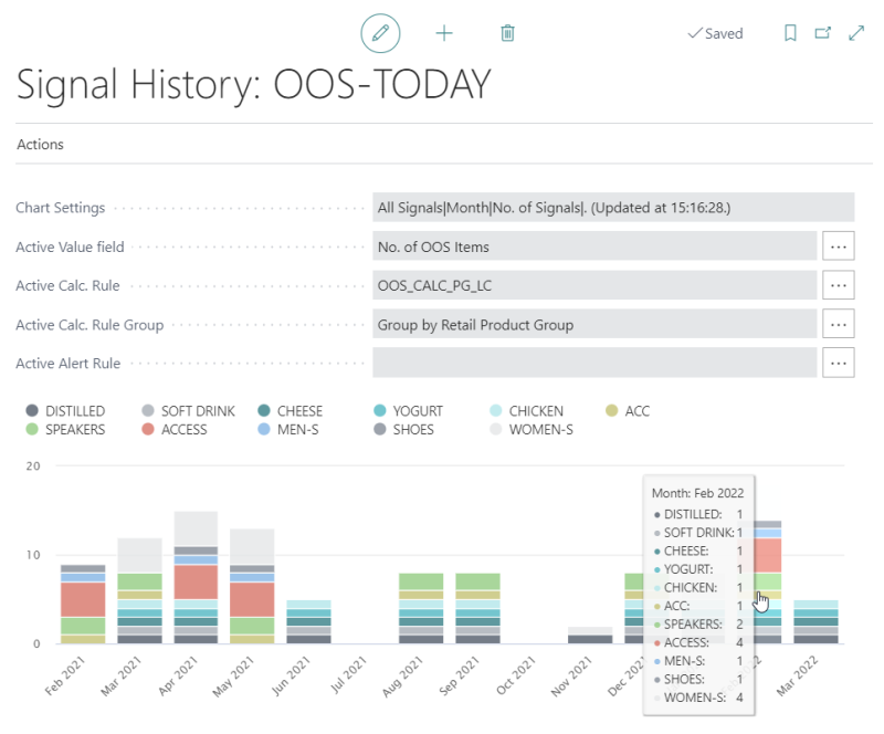
The following is an example of a Signal History Chart, showing the distribution of the signals with out-of-stock items across Feb-2021 to Mar-2022, grouped by Retail Product Group:

Tip: You can click the data points in the chart to open the Actionable Insights Signals page, showing the signal entries behind the chart.
See also
Alert and Notification History Charts